

Start with the work the uniform must do
The best uniform colour is the one that suits the job first, then the logo and finally the style. A warehouse team, a school support team and a front-of-house team all need different things from the same garment type. In Mbombela and across the Lowveld, we often guide clients to think about dust, heat, sunlight and how much time their staff spend outdoors before they pick a colour.
Dark colours can hide marks well, which helps for delivery teams, workshop staff and anyone moving between sites. Lighter colours can feel cooler in the heat and look smart for reception, school wear or client-facing staff. If your team works in dusty areas around White River, Hazyview or Malelane, a colour that keeps its shape visually for longer can save a lot of frustration.
It is also worth considering how the garment will be worn through the week. A colour that looks sharp on day one but shows every stain by Wednesday is not practical. That is where planning matters, because the right choice reduces replacement costs and keeps staff looking presentable without constant special washing.
Match the fabric colour to your logo artwork
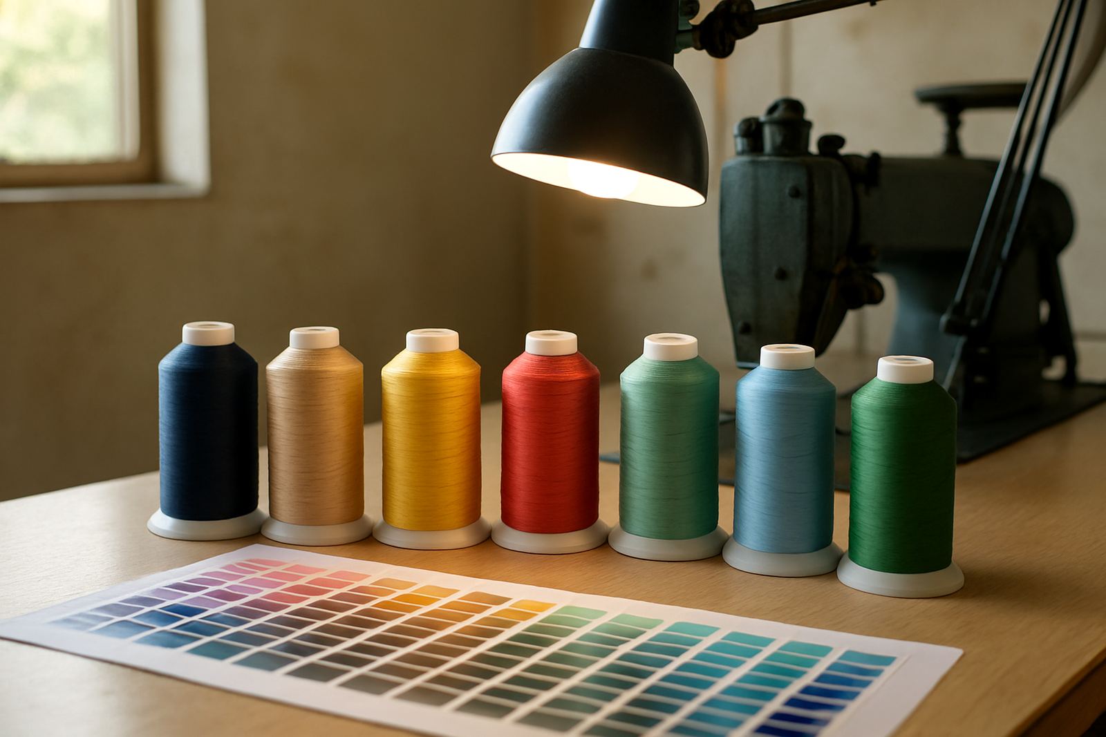
Logo colour and garment colour must work together, otherwise the embroidery or print can disappear into the clothing. A strong logo needs enough contrast to read clearly from a distance, especially on caps, shirts and bibs. If your logo has fine detail, we may recommend a lighter or darker base to keep the lines visible after digitising and production.
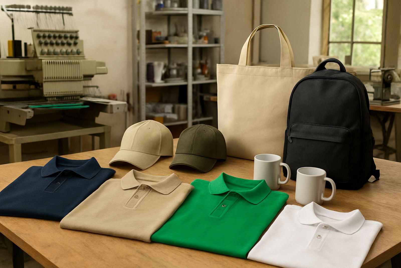
Here are a few practical colour pairings that tend to work well:
- Navy with white, silver or light blue logos for a clean corporate look
- Charcoal with bright accent stitching for a modern and practical finish
- Khaki or olive for outdoor teams where dust and marks are common
- White or light grey for school wear and event clothing where visibility matters
- Black for bold branding, though heat and lint can be more noticeable
When a logo contains several colours, it may not need all of them on the garment. Sometimes a single-thread embroidery colour gives a sharper result than forcing every detail into the cloth. That choice can also reduce production time and help keep bulk orders more affordable.
Think about dirt, washing and coastal humidity
Colour choice should reflect how often the clothing is washed and where it is used. In the Lowveld, dust, sweat and sun exposure can change how a garment looks after only a few wears. Near warmer, more humid areas, clothing also needs to dry properly between washes, otherwise it can start to smell or lose its fresh appearance too quickly.
For that reason, mid-tone colours are often a sensible middle ground. They do not show every speck of dust, yet they still take embroidery and screen printing well. Very pale colours can be crisp but may need more careful handling. Very dark colours can look smart, but they can attract lint and show fade if the fabric quality is not suitable.
It is worth planning for the washing routine too. If your staff take uniforms home, choose colours that can handle frequent laundering without looking tired. If the garments are for school groups or promotional wear, pick colours that keep their tone after repeated washing. A good supplier should tell you honestly when a colour looks nice in sample form but may not be practical for day-to-day use.
Use colour to improve team visibility on site
Uniforms are not only about style. They also help people identify who belongs where, especially in schools, events, retail floors and busy work yards. A clear colour system can separate departments without adding complicated labels. For example, one colour for drivers, another for floor staff and another for supervisors makes it easier for clients and visitors to ask the right person.
Visibility becomes even more important on roadside work, school transport, security details and after-hours collections. In those cases, brighter colours or contrast panels can help. Reflective trim may also be worth considering, depending on the setting. It is not always about making the garment loud, just easy to recognise.
- Choose brighter tones for outdoor movement and public-facing teams
- Use darker tones for heavy-use roles where marks are common
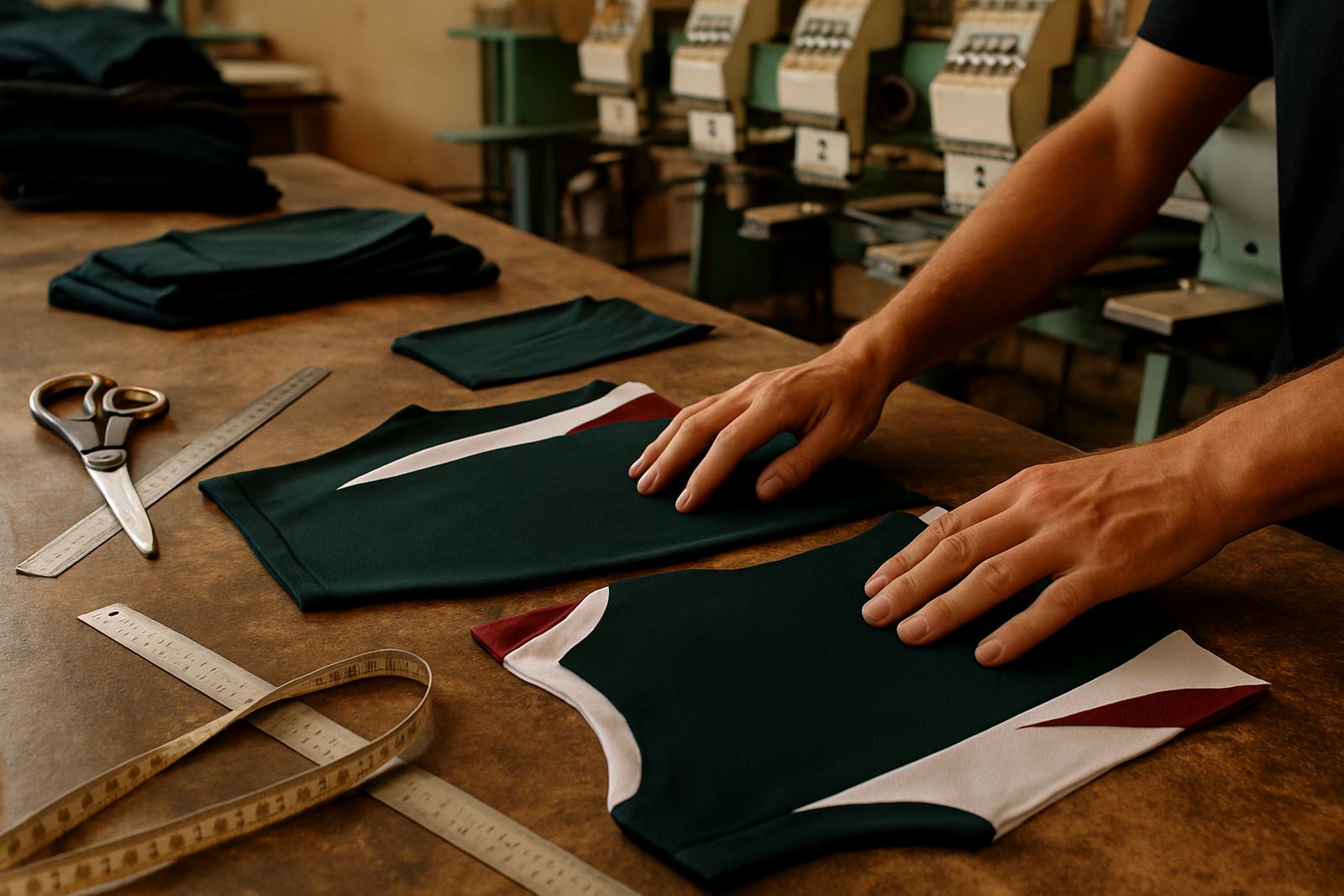
- Add contrast panels to separate departments without extra printing
- Keep the logo placement consistent across all garments for quick recognition
On a practical note, if you are ordering uniforms for multiple branches in Mbombela, White River and Barberton, consistency matters. The same colour can look different across suppliers, so it helps to approve a sample before placing the full order.
Plan for embroidery, screen printing and sublimation
Different branding methods behave differently on different colours. Embroidery usually reads well on most fabric shades, but thread colour must be chosen carefully to avoid low contrast. Screen printing is ideal for strong, simple colour blocks and can be a cost-effective option for larger runs. Sublimation works well on lighter synthetic garments and is often used when a full-colour design is needed.
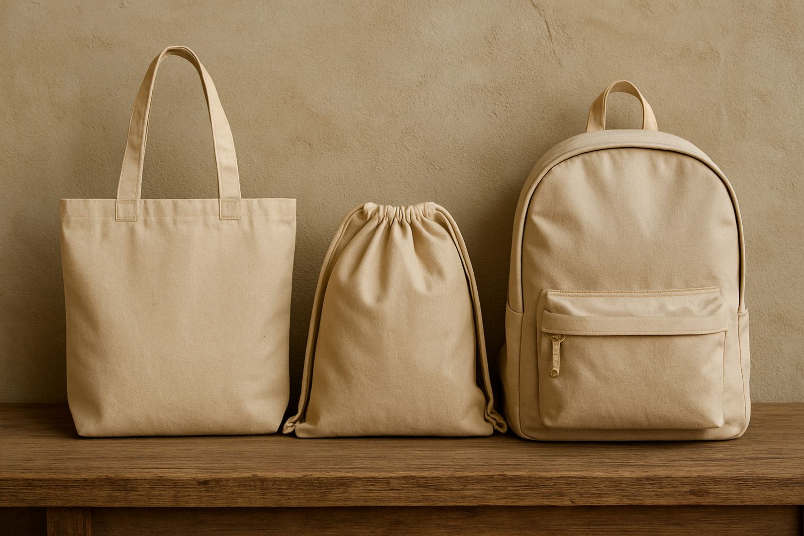
When colour planning starts early, the branding method becomes easier to choose. If your garments need fine detail, we may recommend a base colour that supports the artwork rather than fighting against it. If the order includes caps, bags and name personalisation, the same planning should carry through all items so the set feels coordinated.
It also helps to think ahead about stock control. If your team needs repeat orders through the year, pick colours that are easy to source again. That way you do not end up with one batch in a slightly different shade, which can look untidy in a group setting.
A local example from the Lowveld
A school in the Lowveld area may want staff shirts, sports support wear and event clothing that all sit together visually but still serve different roles. A sensible plan could be navy for general staff, white for formal events and khaki for outdoor helpers. The school logo can then stay consistent across each item, with thread or print adjusted for the best contrast on every colour.
The same approach works for businesses in Mbombela and nearby towns. A distributor may use charcoal for workshop staff, light blue for office staff and black caps for drivers. That keeps the team recognisable while still giving each group a colour that suits the work they do. It also cuts down on arguments later because the colour choice was decided with use in mind, not only appearance.
When you are planning uniforms for a full team, ask these questions before ordering:
- Where will the clothing be worn most often?
- How often will it be washed?
- Should the colour hide dust, mud or marks?
- Does the logo need strong contrast or subtle branding?
- Will the same colour be needed again next term or next season?
A clear answer to those questions usually leads to a better result and fewer costly changes later. It saves time, keeps the team neat and helps every garment do its job properly, which is the point after all.
Keep the final choice practical, not fashionable
Fashion changes quickly, but uniforms need to work for months or years. The safest colour is the one that suits your work, your logo and your washing routine. If you are unsure, it is better to test a few options with mock-ups before approving the full order. That small step can prevent a lot of regret once the clothing is in daily use.
At CK Embroideries in Riverside, Mbombela, we help businesses and schools across the Lowveld plan colours that hold up in real conditions. Whether you need embroidered shirts, printed tees, caps or branded bags, the colour choice should make the logo clearer and the garment easier to live with. That is the part many people miss.
Good uniform planning is not about making a loud statement. It is about choosing a colour that works hard from the first wear to the last wash.