Why clean artwork matters before production starts
Artwork is the starting point for almost every branded item we produce, from embroidered shirts to screen printed staff wear and caps. If the file is unclear, low quality or incomplete, the setup team has to spend extra time cleaning it up before any stitching or printing can begin. That can affect turnaround, especially when a client in Mbombela or White River needs uniforms ready before a school function or a month end promotion.
Good artwork does not have to be complicated. What matters is that the logo, wording and colours are easy to read and match across the items you are ordering. A neat file helps our digitising and print teams work faster and gives you a better result on the final product.
- Use the original logo file if you have it
- Send the clearest version of your artwork available
- Include any colour notes or text changes upfront
- Tell us which items need branding before approval
The most common file problems we see
One of the biggest delays comes from artwork that was copied from a website image or pulled from a low resolution social media post. These files often look fine on a phone screen but break up when enlarged for embroidery or print. Another common issue is text that has been turned into an image, which makes spelling corrections harder and can blur on larger items like bags or jackets.
We also see mixed versions of the same logo. For example, a school may send one version with a slogan and another without it, while a business in Malelane may use a different shade on invoices than on uniforms. That causes confusion and can lead to unwanted variation across the order.
- Low resolution images that pixelate when enlarged
- Multiple logo versions being sent at the same time
- Small lettering that becomes unreadable on caps or chest embroidery
- Very thin lines that do not hold well in stitch or print
- Unclear colour references such as only saying blue or green
How bad colour choices affect branded clothing
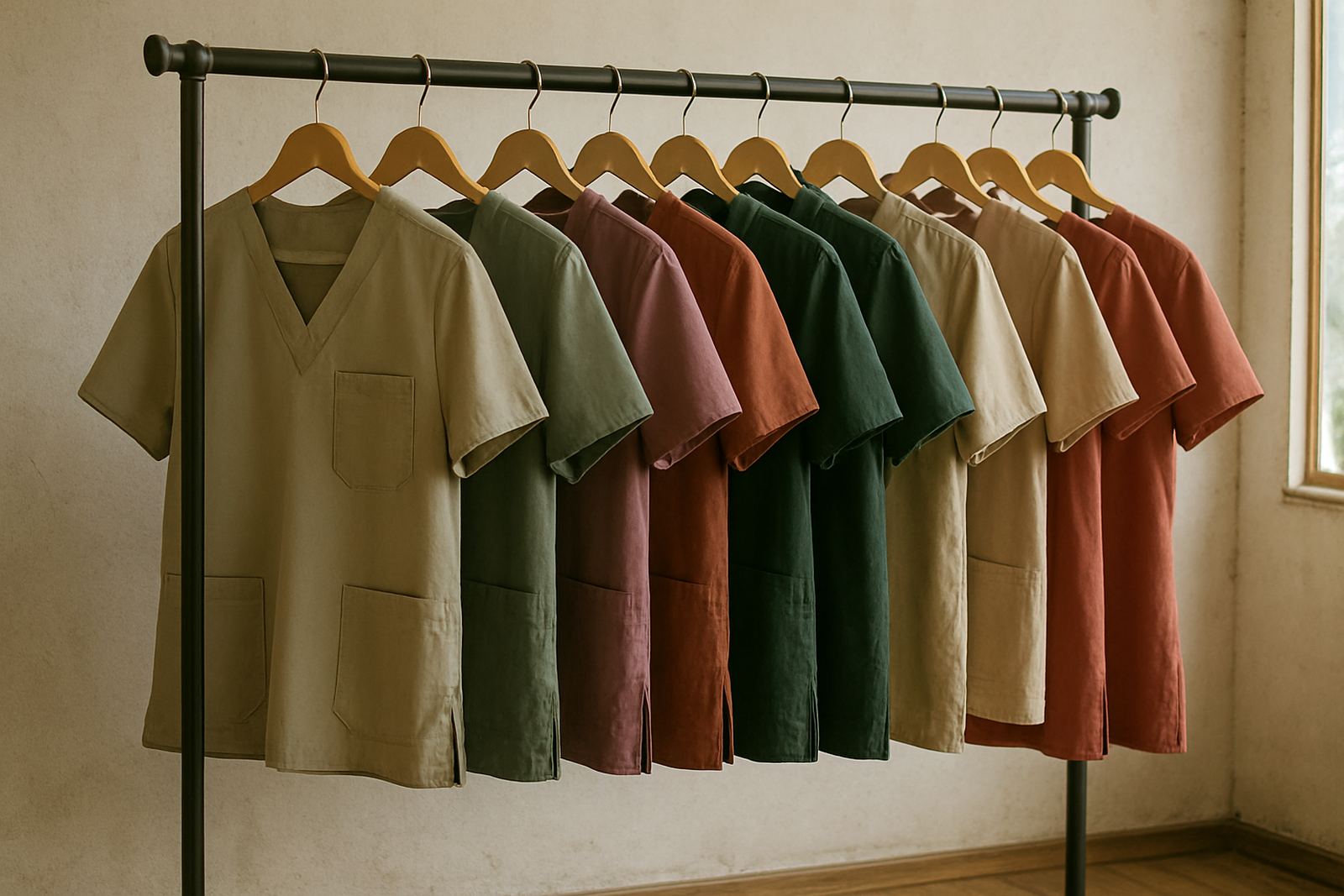
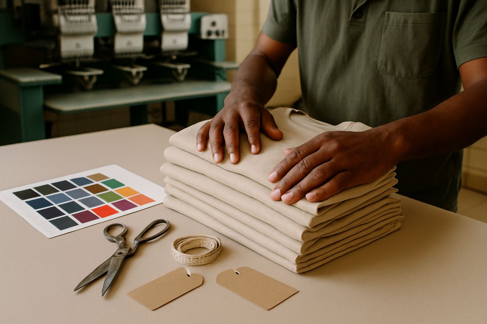
Colour is one of the easiest parts to overlook and one of the most important on the finished item. A logo that looks fine on screen may print differently on navy, black or khaki fabric, and embroidery thread colours need to be chosen carefully for contrast. On darker garments, a pale logo can disappear. On lighter fabric, a strong tone may look too harsh if it was not planned properly.
For businesses in Hazyview or Barberton ordering staff shirts for outdoor use, this matters even more because sunlight and frequent washing can make poor colour matching more obvious. If you want the same logo across embroidery, screen printing and sublimation, it is best to discuss the garment colour before production starts. We can then advise on what will show properly and what may need a small adjustment.
When font changes and spacing cause trouble
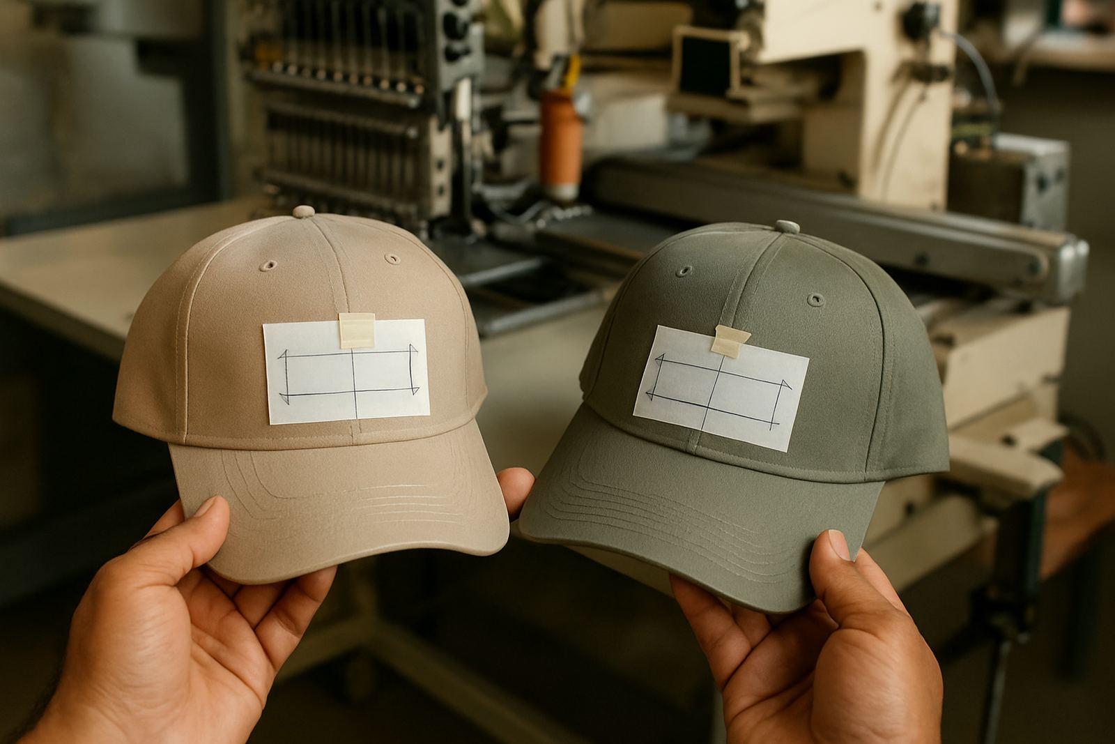
Fonts create more problems than many people expect. A logo that uses thin script lettering may look elegant on paper but become difficult to stitch on a cap front or small shirt pocket. Tight spacing between letters can also close up during embroidery, especially on smaller items. That is why we check whether the text will still read clearly once it is stitched or printed onto fabric.
Spacing issues are also common in names, school mottos and event wording. If a line of text is too long, it may need to be split, resized or simplified to fit the garment properly. For bulk schoolwear branding across the Lowveld, this step saves repeated approvals and keeps the order moving.
- Very thin scripts may not stitch cleanly
- Overcrowded text can lose legibility on small items
- Long slogans may need layout changes for caps and sleeves
- Text placed too close to borders can distort during production
Why embroidery and printing need different artwork treatment
Not every design works the same way for every branding method. Embroidery needs artwork that can be converted into stitches, which means fine details, shading and small lettering must be handled carefully. Screen printing and sublimation allow more colour detail, but they still need clean lines and the right file format to avoid rough edges or unwanted backgrounds.
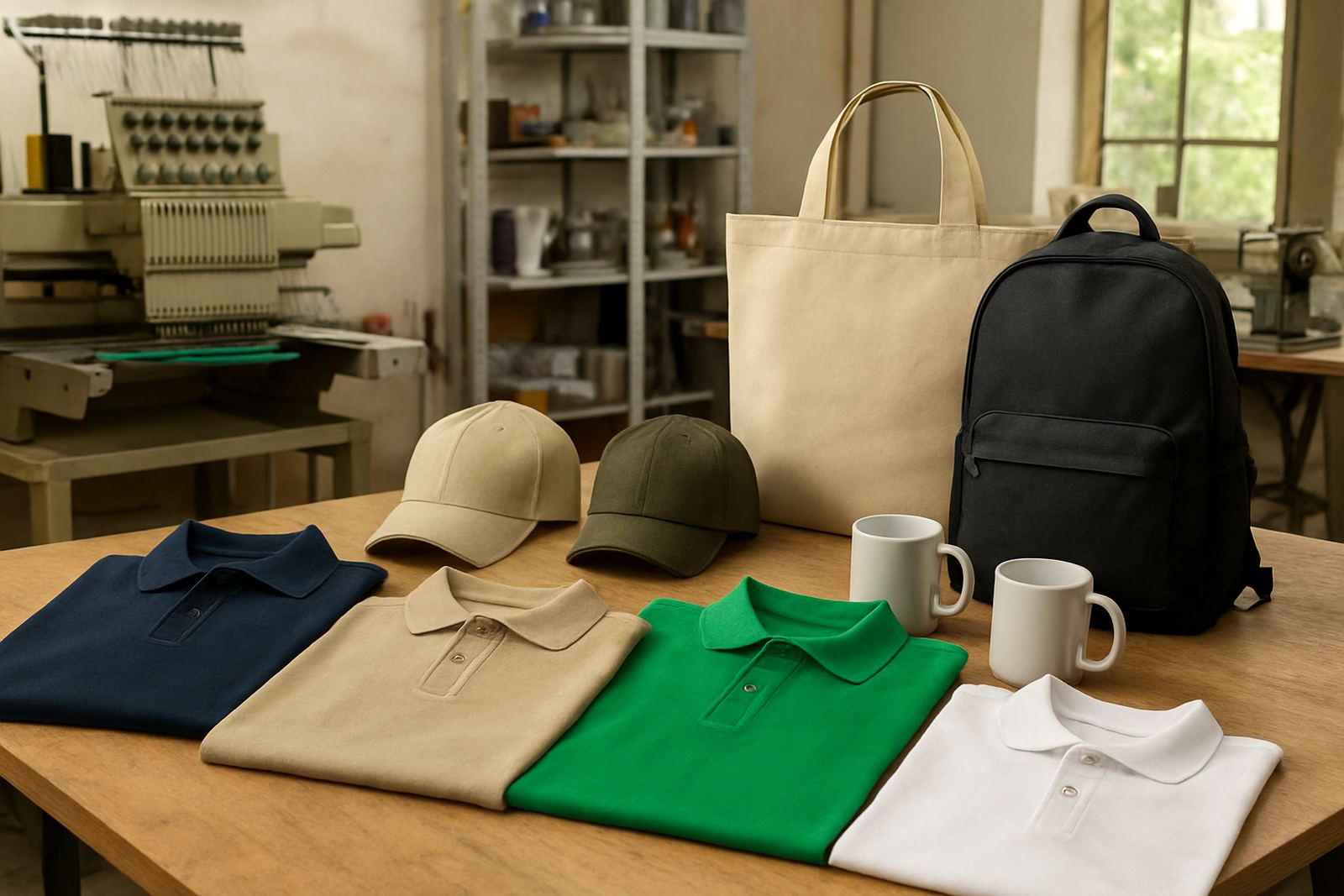
If you are ordering caps, bags and corporate wear in one go, it helps to know what will be embroidered and what will be printed. A logo may look perfect on a shirt but need simplification for a cap. Likewise, a design for promotional gifts may need a different setup from a large back print on a golf shirt. Good artwork planning avoids surprises when the order goes into production.
At CK Embroideries in Riverside, Mbombela, we see this often with mixed orders from businesses in Kabokweni, Ngodwana and Nelspruit Central. One file is rarely right for every item without a few adjustments.
A practical check before you send the file
Before you submit artwork, it helps to run through a short checklist. This saves time during setup and reduces the number of revisions needed before approval. If you are not sure about a file, send what you have and include a note about where it will be used. That gives the team the context needed to advise properly.
A simple local example: a school in White River ordering leavers shirts, caps and gift bags may send one logo file from a newsletter and another from a scanned letterhead. The first may be too small, while the second may have a faded background. With a clearer source file, the branding can be prepared properly for all items in the order.
- Check that the logo is clear and readable
- Confirm spelling on names, slogans and grades
- Tell us which colours must stay consistent
- Say whether the item will be embroidered, printed or both
- Include the quantity and garment type so sizing can be set correctly
How to avoid delays on Lowveld orders
In the Lowveld, order timing often depends on school calendars, trade show dates and seasonal business rushes. If artwork arrives late or needs repeated corrections, the whole schedule can shift. That matters when you are trying to get uniforms ready before a Friday event, or when load-shedding and supplier lead times already add pressure to the week.
The best way to avoid delay is to send the cleanest file you have, plus clear instructions on what you need branded. Our team can then prepare mock-ups and approvals before production starts, whether the order is for a single branch in Barberton or a bulk supply run for several sites across Mbombela, Malelane and Hazyview. A few minutes spent on artwork at the start often saves hours later, and the final finish is usually better too.