Why cap front height changes what your logo can show
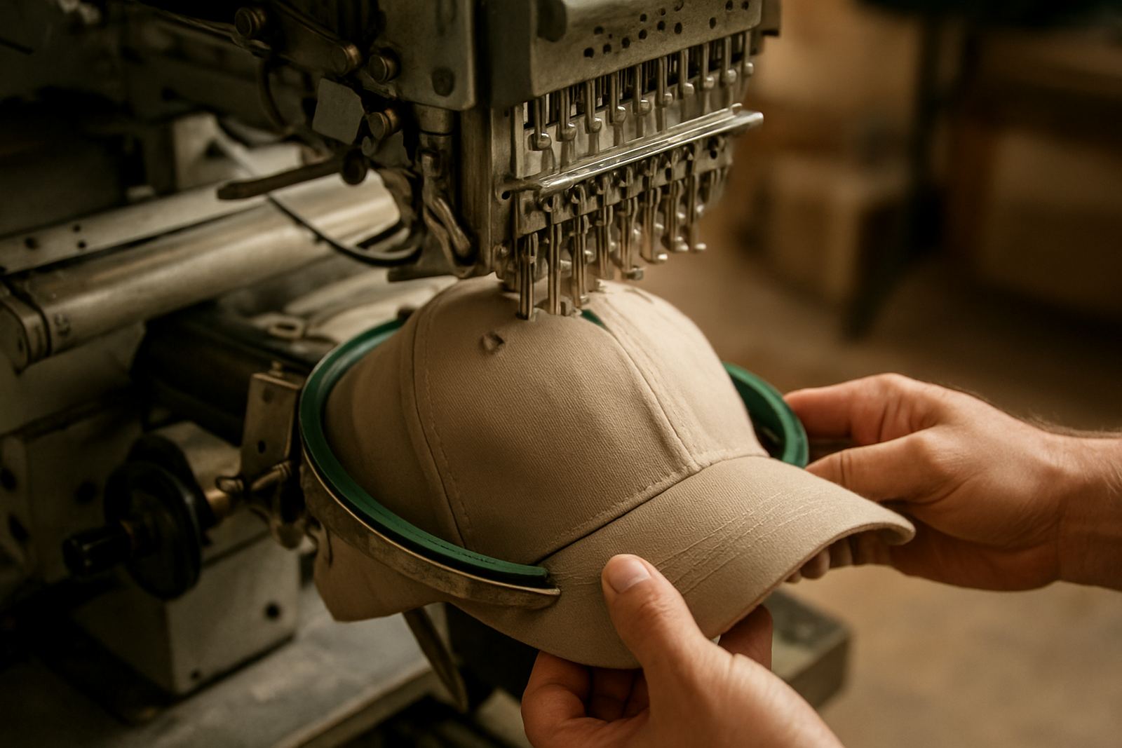
The front of a cap gives you only a set amount of usable space, and that space changes from style to style. A low profile cap has a shallower front, so a logo sits lower and has less vertical room. A structured cap with a taller front gives the design more breathing room, especially for text. If the cap is unstructured or very soft, the fabric can pull slightly when worn, which affects how fine lines and small lettering hold up.
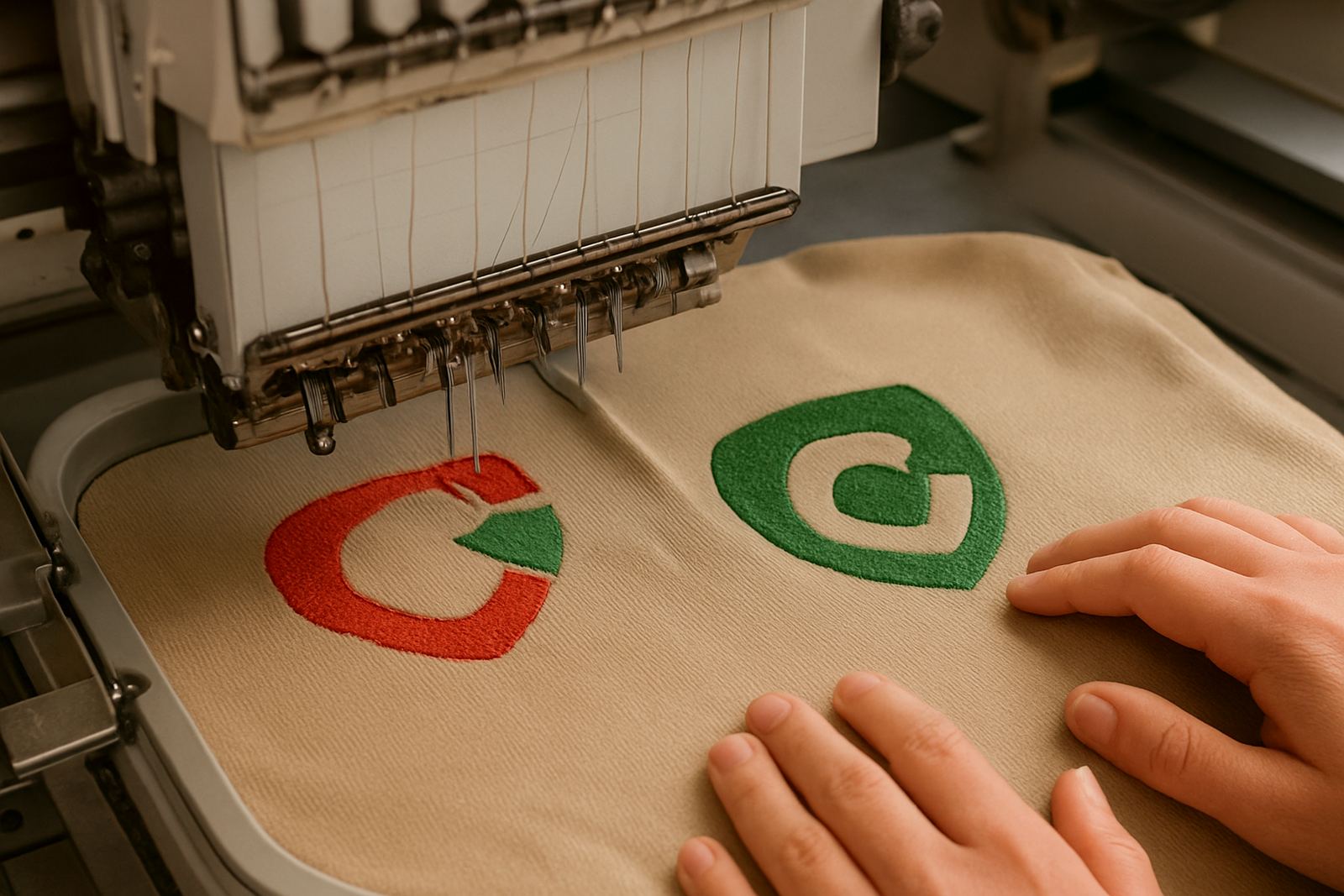
For embroidery, the front height matters even more because stitches need enough space to sit cleanly. A logo that looks fine on paper may need simplifying when it is reduced to cap size. Thin outlines, tiny slogans and close lettering can fill in once stitched. On printed caps, you can push a little finer, but the curve and crown still affect legibility. The cap is worn in motion, so the design has to be read from a short distance, not just up close.
- Taller front panels suit stacked logos and short slogans.
- Low profile caps work better with simple marks or single-line text.
- Soft front caps need extra care with stitch density and backing.
- Fine detail should be tested at actual cap size before production.
The curve at the front can distort neat artwork
A flat logo layout does not always sit flat on a curved cap. The front panel bends away at the sides, which means a wide logo can appear stretched or dip at the edges. This is why a logo that is too long often looks best when it is shortened, stacked or reshaped for the cap face. A circular mark usually works better than a long horizontal line across the crown.
Curve also affects how much space sits above the brim. A logo placed too low can clash with the top edge of the peak, while one that sits too high can feel crowded against the seam. The best cap logos leave enough breathing room so the eye can take in the whole mark at once. If the artwork includes a word mark and icon, the relationship between the two must stay balanced after shaping it to the cap, not just on a computer screen.
- A wide logo may need to be narrowed or stacked.
- Leave clear space above the brim so the design does not feel squeezed.
- Curved surfaces make small text harder to read from the side.
- Simple shapes hold better than busy artwork on rounded fronts.
Embroidery, screen print or sublimation on caps
Different branding methods behave differently on caps. Embroidery is still the most common choice for corporate caps because it gives a raised finish and lasts well in daily wear. It also handles sunlight and regular washing better than many printed finishes, which matters for outdoor teams, school events and promotional use in the Lowveld heat. But embroidery has limits. Very small type, hairline details and soft shading often need to be simplified.
Screen printing on caps works for some styles and quantities, though the curve and fabric texture can affect the finish. It is best for bolder artwork with fewer tiny parts. Sublimation is useful on lighter, specially prepared cap panels and sports-style items, especially where a full-colour image or gradient is needed. Even so, the cap shape still sets the rules. If the design is too complex for the front panel, no method will make it look cleaner than the space allows.
- Embroidery suits strong logos and durable everyday wear.
- Screen printing suits bold artwork with fewer fine details.
- Sublimation suits lighter items and full-colour graphics where the cap construction allows it.
- The smaller the logo, the more important stitch or print clarity becomes.
A practical size guide for readable cap branding
There is no single size that suits every cap, but there are sensible working ranges. For most corporate and school caps, the front logo is often kept modest so it stays readable and does not overpower the cap. A compact logo can look more professional than a large one that wraps awkwardly over the front panel. The right size also depends on whether the cap is for staff, learners, events or promotion. Staff caps usually call for a cleaner, more restrained mark, while event caps can carry a bolder design.
As a rule, a logo should be large enough to read quickly from a few metres away, but not so large that it distorts over the curve. If the logo includes a business name, the name should remain clear when the cap is worn and viewed at a slight angle. For detailed artwork, it is often better to use a simpler version on the cap and keep the full logo for shirts, jackets or bags. That way the branding stays consistent without forcing the cap to do too much.
- Keep wording short where possible.
- Use a simplified mark if the original logo is detailed.
- Check logo size on the exact cap style, not a generic mock-up.
- Allow enough space for stitching or print placement above the peak.
How Lowveld weather changes cap branding choices
In Mbombela and the wider Lowveld, caps are not just for style. They are worn in strong sun, dust and frequent outdoor conditions. That means the logo has to stay legible under bright light and after regular use. Thick thread and good backing help embroidery hold its shape, while clear colours improve visibility. Very pale thread on a light cap can disappear in midday sun, and fine dark text on a busy coloured front can become hard to read.
Humidity also plays a part. In the rainy season, caps can be stored, worn and washed more often, so the branding must remain stable. For schools and contractors working between White River, Hazyview, Malelane and Barberton, practical choices usually win over decorative ones. A neat 2 colour logo often outperforms a crowded full-colour version if the cap is used daily. It is not about doing less for the sake of it, it is about making sure the branding still looks sharp after real use.
For a school order in White River, for example, a simple crest on the front of a structured cap can stay clear for learners and staff. If that same crest includes small lettering, it may need to be adjusted before stitching so the school name does not blur at cap size. That small step saves wasted stock and keeps the order looking consistent across the batch.
What to check before approving a cap logo
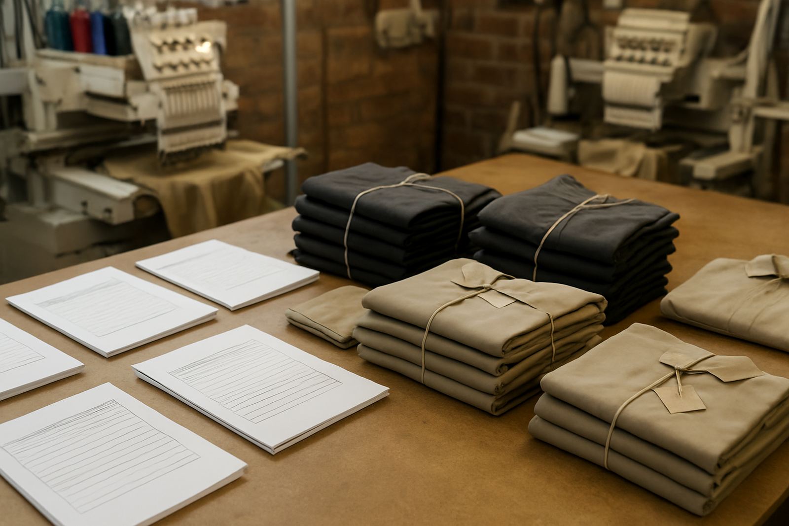
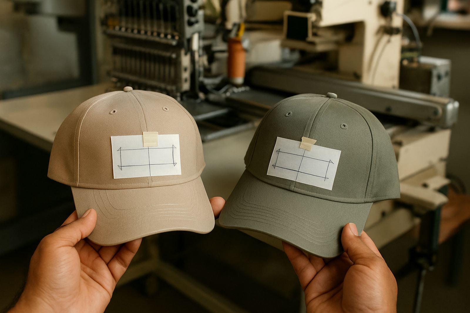
Before production, it helps to check the cap logo at the exact size and on the exact cap type. A good approval process prevents issues later, especially with bulk orders for schools, sports groups or companies ordering across several branches. The front panel shape, seam position and crown height should all be part of the review. If the logo sits too low or too wide, it should be adjusted before the first unit is made.
A proper approval should also confirm colour contrast, text size and placement. If the design includes a slogan, decide whether it belongs on the cap at all. Many businesses are better served by a shorter front mark and a fuller version on shirts or jackets. The goal is not to force the whole identity onto one small surface. It is to make the cap look clean, clear and useful in everyday wear, and avoid redoing a whole order later.
- Confirm front panel style and height.
- Check the logo at actual cap size.
- Review text clarity from arm's length and a few metres away.
- Approve the final placement before bulk production starts.
Cap branding that fits the job, not just the artwork
Good cap branding starts with the cap itself. Once the front height, curve and wear conditions are understood, the logo can be adjusted to suit the surface instead of being forced onto it. That usually gives a cleaner result and a longer lasting finish. For Lowveld businesses, schools and teams, that practical approach saves time and avoids disappointment when the finished caps arrive.
At CK Embroideries in Riverside, Mbombela, cap branding is handled with the same care as corporate wear and school items. Our team works through digitising, stitch planning, print options and approval checks so the final cap suits the purpose. Whether the order is for Nelspruit Central, Kabokweni, Ngodwana or further afield in the Lowveld, the right logo size starts with the right cap style and a clear view of how it will be worn.
If you are planning cap branding for staff, learners or a promotion, the safest rule is simple: make the logo as large as the cap can comfortably hold, and no larger. That is what keeps it readable.