Why the cap’s shape decides the stitch plan
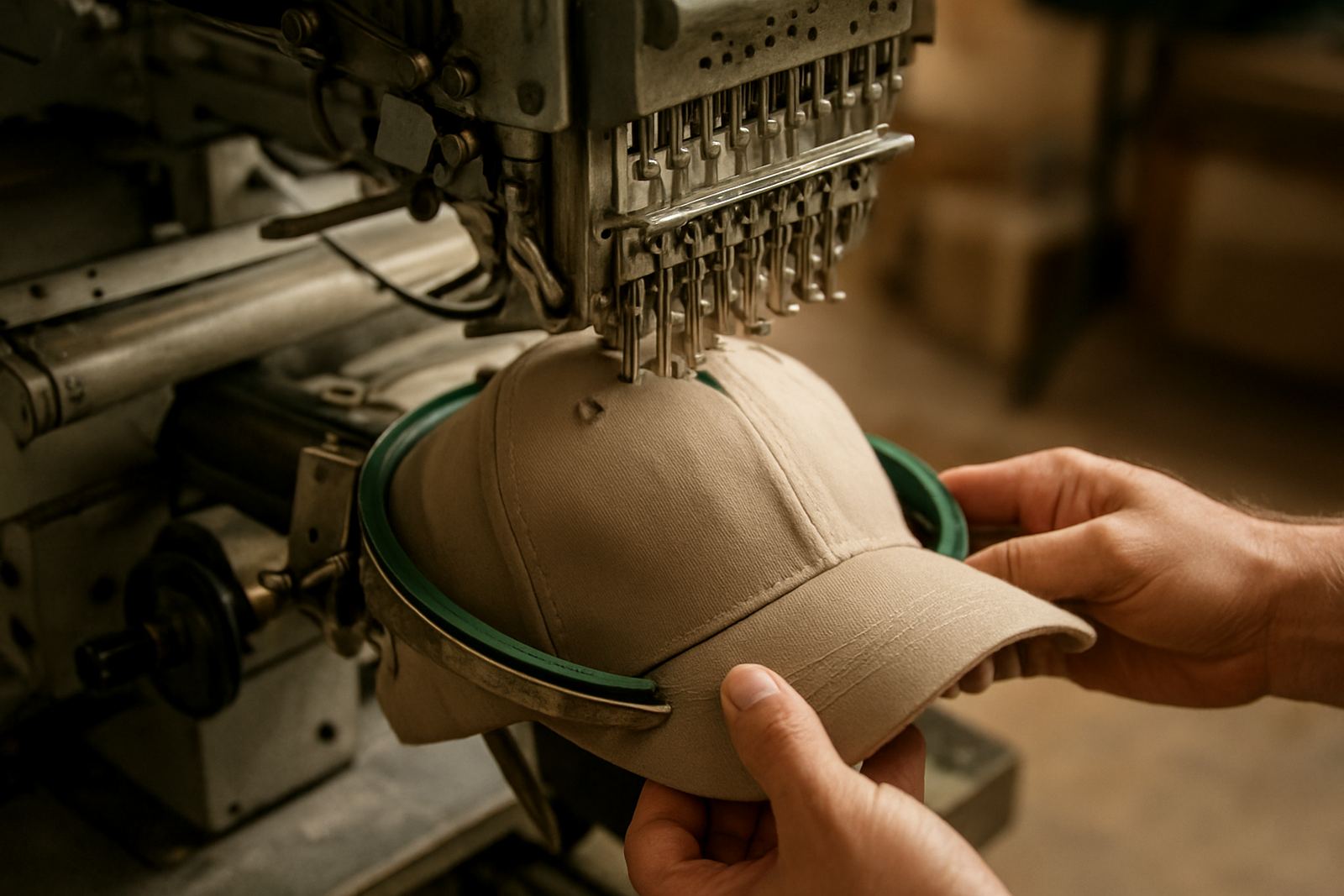
When a logo is embroidered on a cap, the first question is not the design itself but the cap structure. A structured five-panel cap, a six-panel cap and a soft unstructured cap all take thread differently. The front panel on a structured cap holds its shape well, while a softer cap can shift a bit during stitching and wear. That changes how tight the stitches sit and how clean the edges look.
Curved peaks and low front crowns also affect the angle of the machine head and the direction of the stitch lines. If the logo is too detailed for the space, the stitching can crowd together and the letters lose clarity. A good setup respects the cap shape from the start, rather than forcing a flat artwork onto a rounded surface.
- Structured caps hold bold logos better than very soft caps.
- Six-panel caps usually give a more centred front area for branding.
- Low crowns need simpler logos and careful thread direction.
- Curved peaks can hide part of the lower design if the placement is too low.
How logo simplification protects legibility
Small text, thin borders and tiny detail can disappear on a cap. On a shirt pocket, a logo may have enough space, but on a cap front panel there is often only a limited area to work with. That is why logo digitising matters. We reduce fragile detail where needed, keep line weight practical, and make sure the final stitch file suits the size of the cap.
This is not about making the logo less professional. It is about making sure it reads clearly from a few steps away and still looks smart after repeated wear and washing. For schools, contractors and retail staff in the Lowveld, the cap often becomes a daily item, so the branding has to stay visible and neat.
- Keep slogan text off the cap if the main name already fills the space.
- Use bold letters rather than very fine scripts for small branding.
- Avoid tiny shadows, gradients and closely packed outlines.
- Let the main symbol lead the design, if there is one.
Common cap styles we embroider for Lowveld clients
Different clients in Mbombela, White River, Hazyview, Malelane and Barberton ask for different cap styles depending on the worksite, school activity or promotional use. A school team may need a uniform look for sports days, while a farm supply company might need practical caps for field staff. We match the branding to the cap type and the way it will be used in the heat, dust and strong Lowveld sun.
Before production starts, we check the cap construction and recommend the most suitable layout. Some caps take a centre-front logo well, while others look better with a smaller side mark or a single-colour treatment. The aim is to keep the item wearable, not overloaded.
- Structured caps for corporate staff and events.
- Trucker-style caps for casual promotions and giveaways.
- Peak caps for school trips, sports and outdoor use.
- Soft caps for simple branding where comfort comes first.
Thread, density and placement need to work together
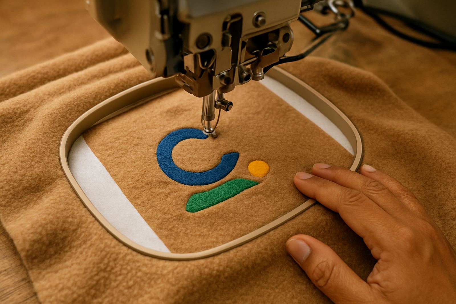
Embroidery is not only about the artwork. Thread density, underlay and placement all influence the final result. If the stitch density is too tight, the cap front can become stiff and pucker near the centre seam. If it is too light, the logo may look thin and uneven. Good cap embroidery needs a balance that suits both the fabric and the intended size of the logo.
Placement also matters. A logo that sits too close to the peak may be hard to read when the cap is worn. One that sits too high can feel unbalanced. The best position is usually where the logo clears the seam lines and remains visible from the front. In hotter weather, especially when staff are on outdoor duty, that clean placement helps the cap look tidy for longer.
- Stitch density must suit the cap fabric and panel structure.
- Underlay helps support the top stitches and keeps the shape neat.
- Placement should avoid seam bulk and peak shadow.
- Thread colour should contrast clearly with the cap colour for easy reading.
A practical Mbombela example: school caps for winter sport
A common local order is for a school in Mbombela or White River needing caps for winter sport, staff events or fundraisers. The school may want a crest, learner name or house colour on a cap that will be worn every week. In that case, the design has to be simple enough for the small front space but strong enough to hold up on a busy campus.
We often recommend one main embroidered mark on the front and, where needed, a name or smaller detail on the side. For bulk orders, the caps are checked in batches so the placement stays consistent across every item. This matters when there are different sizes, mixed colours or a tight delivery schedule. It also helps with sorting and packing before collection.
For schools and businesses across the Lowveld, cap branding works best when the logo is planned for the cap first and the artwork second. That approach saves time and helps avoid costly rework later.
What to prepare before sending in your cap order
A clear brief makes the process easier and keeps the order moving. If you are branding caps for a staff rollout, a school event or a promotional campaign, it helps to know the cap colour, quantity, logo size and whether the branding should be front only or include a side mark. If the logo is not yet digitised for embroidery, we can prepare it for stitch work and set up mock-ups for approval.
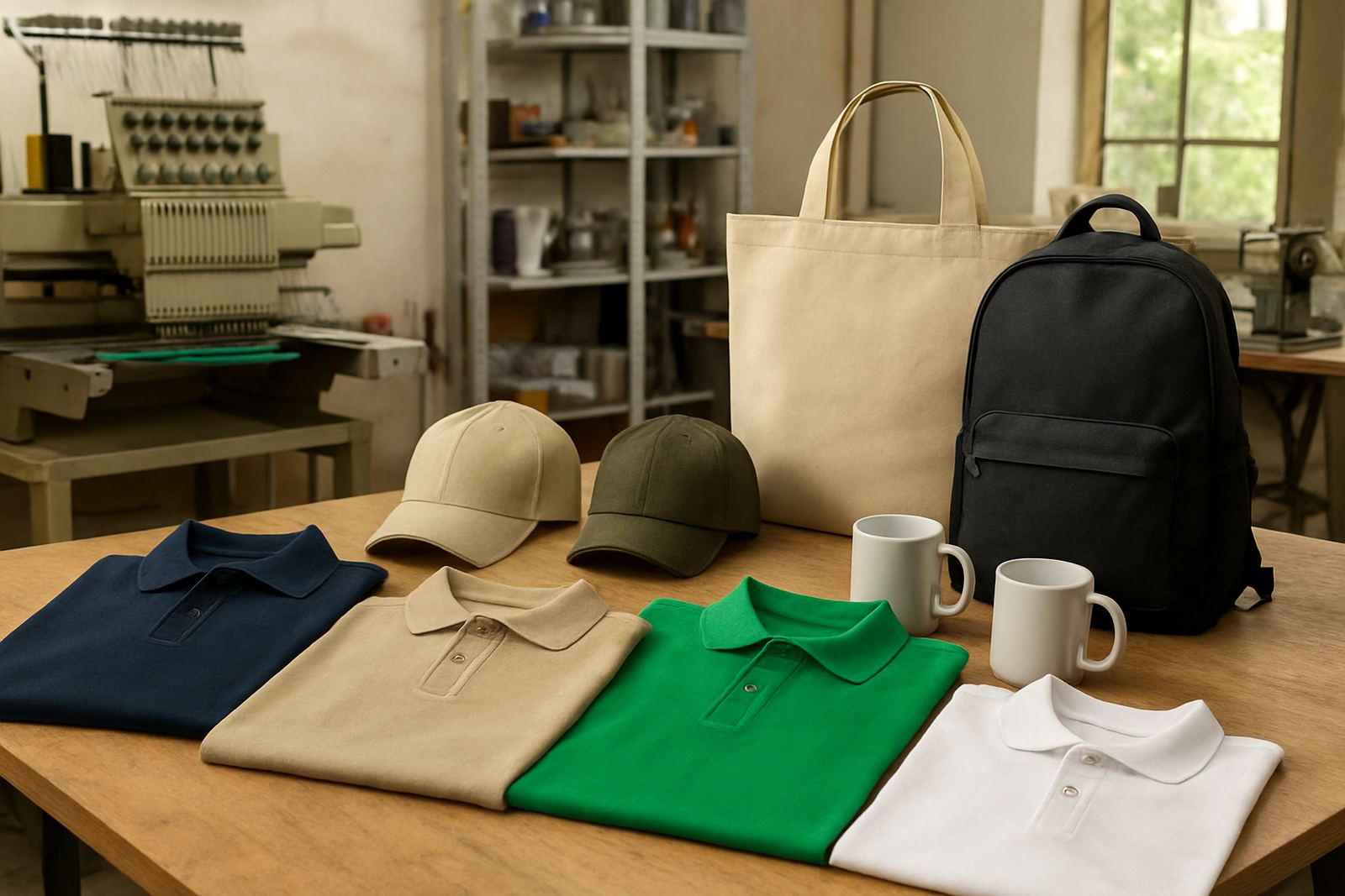
Customers from Mbombela, Kabokweni, Ngodwana and nearby towns often collect a mix of caps, corporate wear and other branded items in one order. We can pack bulk orders neatly, which helps when items need to be handed out by department, grade or branch. That is especially useful for schools and companies with multiple sites.
- Send a clear logo artwork file if available.
- Confirm cap colour and quantity before production starts.
- Tell us if you need names, initials or role titles added.
- Ask for a mock-up where the layout needs approval.
CK Embroideries, based in Riverside, Mbombela, supplies cap branding for businesses and schools across the Lowveld with practical advice, careful digitising and production that suits real use.